🔗 가상 선택자
::before: 요소 앞에 생성::after: 요소 뒤에 생성

<style>
    .before::before {
    content: "before는 요소 앞에 생성됨";
    color: red;
    }

    .after::after{
    content: "after는 요소 뒤에 생성됨";
    color: teal;
    }
</style>
.
.
.
<p class="before">before 예시</p>
<p class="after">after 예시</p>
<p class="before after">before/after 예시</p>
📘 가상 선택자 사용 예시

<style>
    li {
        list-style: none;
        display: inline-block;
        padding: 10px;
    }
    li::after {
        content: "|";
        color: gray;
        display: inline-block;
        margin-left: 25px;
    }
    li:nth-child(4)::after {
        content: "";
    }
</style>
.
.
.
<li>로그인</li>
<li>회원가입</li>
<li>마이페이지</li>
<li>사이트맵</li>
🔗 transition
- 위치 속성 :
top,left,right,bottom - 크기 속성 :
width,height - 박스 속성 :
margin,padding - 테두리 속성 :
border-width,radius,color style - 색상 속성:
color,background-color - 투명도 :
opacity - 형태 :
transform(기울기, scale)
.box {
    width: 100px;
    height: 100px;
    background-color: orange;
    transition: all 2s; /* 2초뒤 모든 효과가 나타남 */
}

/* 마우스 hover했을 떄 */
.box:hover {
    background-color: teal; /* 배경색 teal로 변경 */
    transform: scale(2); /* 크기 2배 커짐 */
    translate: 50px 50px; /* 오른쪽 50px, 아래 50px 이동 */
    border-radius: 50%; /* 둥글게 */
}

/* 마우스로 클릭했을 때 */
.box:active {
    background-color: tomato; /* 배경색 tomato로 변경 */
}
🫧 transition 속성
transition-delay: 지연시간transition-duration: 변환 시간transition-property: 대상 속성transition-timing-function: 시간 대비 변화량

cubic-bezier: transition-timing-function을 직접 조작할 수 있음
cubic-bezier를 만들어 볼 수 있는 웹사이트
cubic-bezier.com
cubic-bezier.com
🔗 transform
- 크기, 각도 등이 변형되는 것
- 2차원(XY평면), 3차원(XYZ평면)
- 2차원 좌표계 : 왼쪽-위가 원점(0,0)
- 3차원 좌표계 : 2차원 + z축 - z+ (모니터 앞으로), z- (모니터 뒤로)
rotate(degree): 회전translate(X, Y): X, Y 좌표만큼 이동translateX(x): x좌표 이동translateY(y): y좌표 이동scale(X, Y): x축, y축 방향으로 X, Y 만큼 늘림scaleX(x): x축 방향으로 늘림scaleY(y): y축 방향으로 늘림skew(X, Y): x축, y축 방향으로 X, Y 만큼 기울임skewX(x): x축 방향으로 기울임skewY(y): y축 방향으로 기울임transform-origin: 앵커값(회전기준)
📘 사용 예시

section {
    width: 100px;
    height: 100px;
    border: 5px solid black;
}
div {
    width: 100%;
    height: 100%;
    background-color: tomato;
    transform: rotate(45deg); /* 45도 회전 */
    transform-origin: left bottom; /* 기준점 이동 */
}
.
.
.
<section>
	<div></div>
</section>
section {
	width: 100px;
	height: 100px;
	border: 5px solid black;
}
div {
	width: 100%;
	height: 100%;
	background-color: teal;
	transform: translate(30px, 30px) rotate(30deg);
}
.
.
.
<section>
	<div></div>
</section>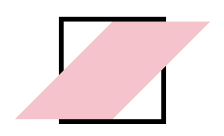
section {
	width: 100px;
	height: 100px;
	border: 5px solid black;
}
div {
	width: 100%;
	height: 100%;
	background-color: pink;
	transform: skewX(-45deg);
}
.
.
.
<section>
	<div></div>
</section>
✈️ 출처
한국경제신문 x 토스뱅크 풀스택 훈련
'프론트엔드 > CSS' 카테고리의 다른 글
| Tailwind 어떻게 쓰는건데? (0) | 2025.01.15 |
|---|---|
| CSS 중급 III (0) | 2025.01.14 |
| CSS 중급 (1) | 2025.01.12 |
| CSS 기초 II (1) | 2025.01.09 |
| CSS 기초 (1) | 2025.01.08 |